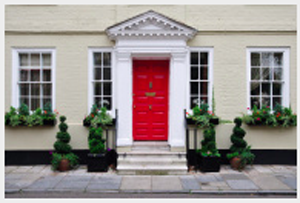
The first thing a good real estate agent will tell you to do when listing your house is to paint the front door so it stands out from the rest of the house. A visible, easy-to-find front door says, “Welcome, this is the way in.”
Your tournament website should do the same thing. Unfortunately, many soccer tournament sites are so intent on fancy design, featuring sponsors and whatever else that they forget to paint the front door. A team is left searching around, wondering “How the heck do I apply to this tournament? When is it? WHERE is it?”
I often wonder how many teams just give up and apply somewhere else.
From time to time, we get requests from a tournament director to “jazz up” the front door, to make their tournament look different from everyone else.
“Why,” we ask, “are your applications slowing down? Are teams finding it difficult to apply?”
“To the contrary,” they say. “Applications are consistently up year over year. Your software is easy to use and everyone knows how to apply, get schedules, maps and scores easily.
“So why are you asking us to obscure your front door?”
Our Advice: Simplify. Remember your mission of making it easier to get teams to find you, apply quickly and find game schedules and results easily. On every contact point on a TourneyCentral website, we post the where, when and how much right at the top of the page. The Apply menu option is always on the main menu of every page. Nothing is more than one click away.
Instead of focusing on the next whizz-bang whirly-gig thing to set your tournament apart, focus on your content. Make sure your news is up-to-date and timely. Make sure your schedules are correct and posted as quickly as possible. Update your scores as soon as your can after the game ends. Promote your sponsors and advertisers. Use your social media channels (Twitter, Facebook, Instagram) often and earnestly.
Each of the TourneyCentral tournaments has the same tools. What you do with yours is what will set you apart.

 The twelfth annual
  The
The