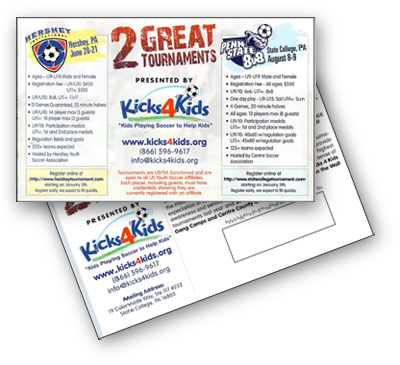
A postcard for the Hershey Tournament and the Penn State 8v8 arrived earlier this week. It got my attention, not only because the two events are TourneyCentral.com tournaments, but because it was well designed and executed. Here’s why.
I knew what it was about quickly
I didn’t have to open a letter or fight with that low-grade postage wafer that tears most of the information off the top of the flyer folded in thirds. “2 great tournaments.” The logos were right there on top, leading the description.
5Ws
Who, What, When, Where, Why and How were listed in bullets points and were easy to read. No disclaimers were mixed in to “CYA” the tournament. Just the facts and where to go to get more.
Contact information front and center
The web address was right there as was the email AND PHONE NUMBER. Chances are most folks will go to the web site first, but there are a few coaches left who still feel more comfortable picking up the phone and getting a feel for how real the event is.
It is print
I’m an advocate for the Internet, but nothing replaces 4-color print — even if only a postcard — to let your guest teams know that you believe in your event enough to design a postcard, print it out and pay for postage to mail it to them. Print says “I am real.”
Good use of white space
The designer did not stuff every square inch of postcard space with crap. Get the basics out, push your audience to the web site where they can read more if they need to. Just the facts and lots of breathing room.
What I would have liked to see
– A human face, a soccer player or coach. A family that has been helped by the charity.
– The web address bigger for each event
– Rule of thirds and some offset. The tournament panels being side-by-side instead of flanking the middle content.
– A little more contrast between the actual soccer tournament events and the Kicks4Kids organization.
– More WIIFM (What’s in it for me) to the coach and less about the hosting organization.
– A TourneyCentral logo, showing that they are hosted by the best (but that is really selfish on my part.)
Please feel free to leave a comment if you disagree with my list.
Print and direct mail is not dead. Neither is the US Postal Service. A great soccer tournament will use a mix of email marketing, print and word-of-mouth to get the message out about their tournament.
