Simple, readable maps go a long way toward getting your teams where they need to go with a minimum of confusion. On a soccer tournament web site, a readable layout with clearly marked field numbers is a must.
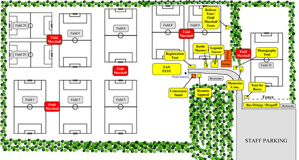
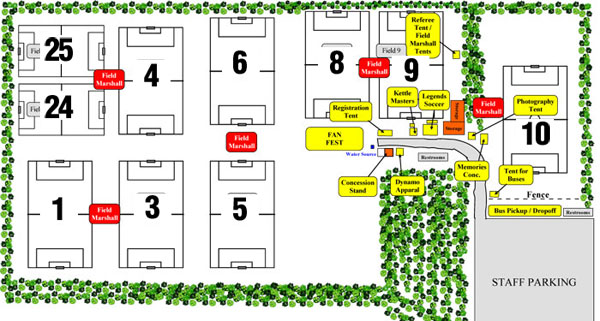
The graphic below shows an example of an unfriendly versus friendly layout.
Web-Unfriendly

Web-Friendly

Most of the time, your maps will come from a parks department or a graphic designer who has designed them to be great for printing in a program, but almost entirely unreadable on a web site. Make sure to specify that you need the maps to work across ALL media — online and in print. If need be, be ready to re-work them with large field numbers however you can if your graphics people can’t. Even if that means white sticky dots and a Sharpie.
Keep your field maps simple and readable. Big field numbers first, secondary information only if there is room. You can always have more detailed maps posted at the fields.